



TL;DR
Google just updated its ‘G’ icon for the first time since 2015, replacing the solid color segments with a smooth gradient.
The new logo is currently only visible in the Google app on iPhones and Pixel devices, with no changes yet on other Android phones or the web.
This design aligns with the gradient style used in newer Google products like Gemini, suggesting a broader visual refresh may be coming.
The main Google wordmark and other product logos like Chrome and Maps remain unchanged for now.
Google has quietly updated its signature “G” icon for the first time since 2015. You’ve probably seen it already if you’re using a Pixel or an iPhone.
The new look doesn’t scream for attention, but it marks a subtle shift in how Google wants to present itself, especially on mobile.
The New ‘G’ Now Uses Gradients
The update to the Google app on iOS and Pixel devices shows the ‘G’ with its familiar red, yellow, green, and blue colors, but now blended into each other.
The sharp divisions between the colors are gone. The new design creates a gradient flow that feels more in line with how Google’s newer product logos look, especially the Gemini AI brand.
If you’ve used Gemini or paid attention to other recent updates, you’ll notice the same kind of gradient effect. This shift seems intentional. Google is starting to bring consistency across its visual branding.
According to 9to5Google, the change has rolled out in version 15.20 of the Google app on both platforms. As of now, the updated “G” only appears on iPhones and Pixel phones. If you’re using another Android phone or checking the web version, you’ll still see the old version.
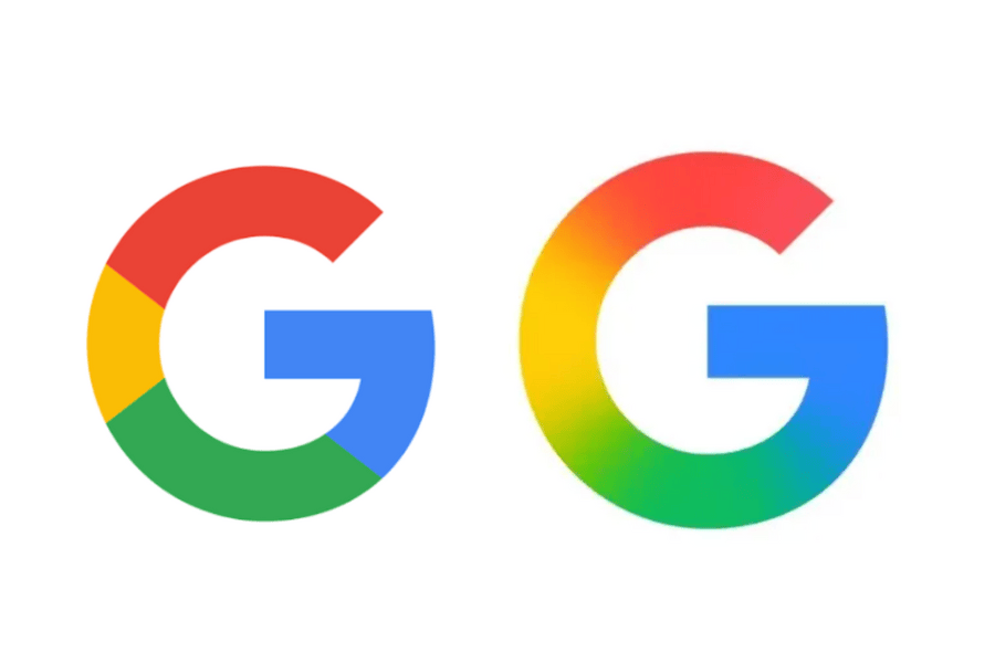
At first glance, it may seem like a minor change. But for a company like Google, logo tweaks usually reflect larger branding strategies.
The original multi-color ‘G’ logo debuted in 2015, when Google moved to a sans-serif font and began consolidating its image across products. That update replaced the older serif font and introduced a simpler, friendlier design language.
Also Read: OpenAI eyes Chrome as DOJ pressures Google to break up its search empire
Now, ten years later, Google seems to be moving from clean-cut colors to smoother gradients. This isn’t a complete brand overhaul, but it hints at a broader effort to refresh visual cues, especially in the era of AI and next-gen interfaces.
The new look doesn’t come with an official blog post or marketing splash. That’s typical for minor brand touch-ups. But it’s worth noting that Google has done similar soft updates in the past. Sometimes, it uses mobile platforms as early test beds before a wider rollout.
What’s Not Changing (For Now)
The main six-letter Google wordmark is staying the same. There’s no update (yet) to the primary logo you see on Google Search or Chrome tabs.
Likewise, other iconic product logos like Chrome, Maps, or Gmail haven’t changed their color patterns. But given how easily their segmented color designs could adopt gradients, they might follow soon.


Leave a Reply